
Explore the design system behind this AI course
Reusable typography, surfaces, components, motion, and layouts extracted from the reference page.


Typography
Scale, rhythm, and hierarchy from the original HTML.
Scale content without limits.
The next era of content is here.
Meet your instructors
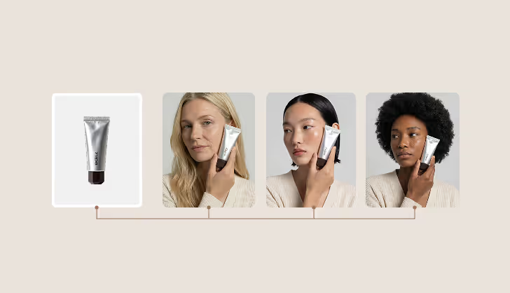
Generate Product Shots
Generate images and videos for your socials, shop, and ads using your products or services at scale.
The way content is created has changed forever.
Colors & Surfaces
The page is built from warm neutrals, brown text, white cards, soft borders, and one bronze accent.
Card surface
Large content cards use the mid-beige surface, xlarge radius, and clipped media.
White, radius medium, hairline neutral border, hidden overflow.
UI Components
Buttons, cards, tabs, accordions, media blocks, feature rows, and testimonial cards that appear in the reference.
Scaling without compromising quality.
You want to create more content without expanding production costs.
Delivering client visuals faster.
Tabs keep the same Webflow classes, timings, and easing values from the reference.
Generate Scenes
Large cards combine text blocks and media slots with clipped xlarge radius.
No, the accordion keeps the reference interaction hook and collapsed inline dimensions.
Layout & Spacing
Containers, grids, split layouts, section spacing, and media galleries are reused from the page.
Create Content at Scale
Three-column layout pattern.
Speed up Your Process
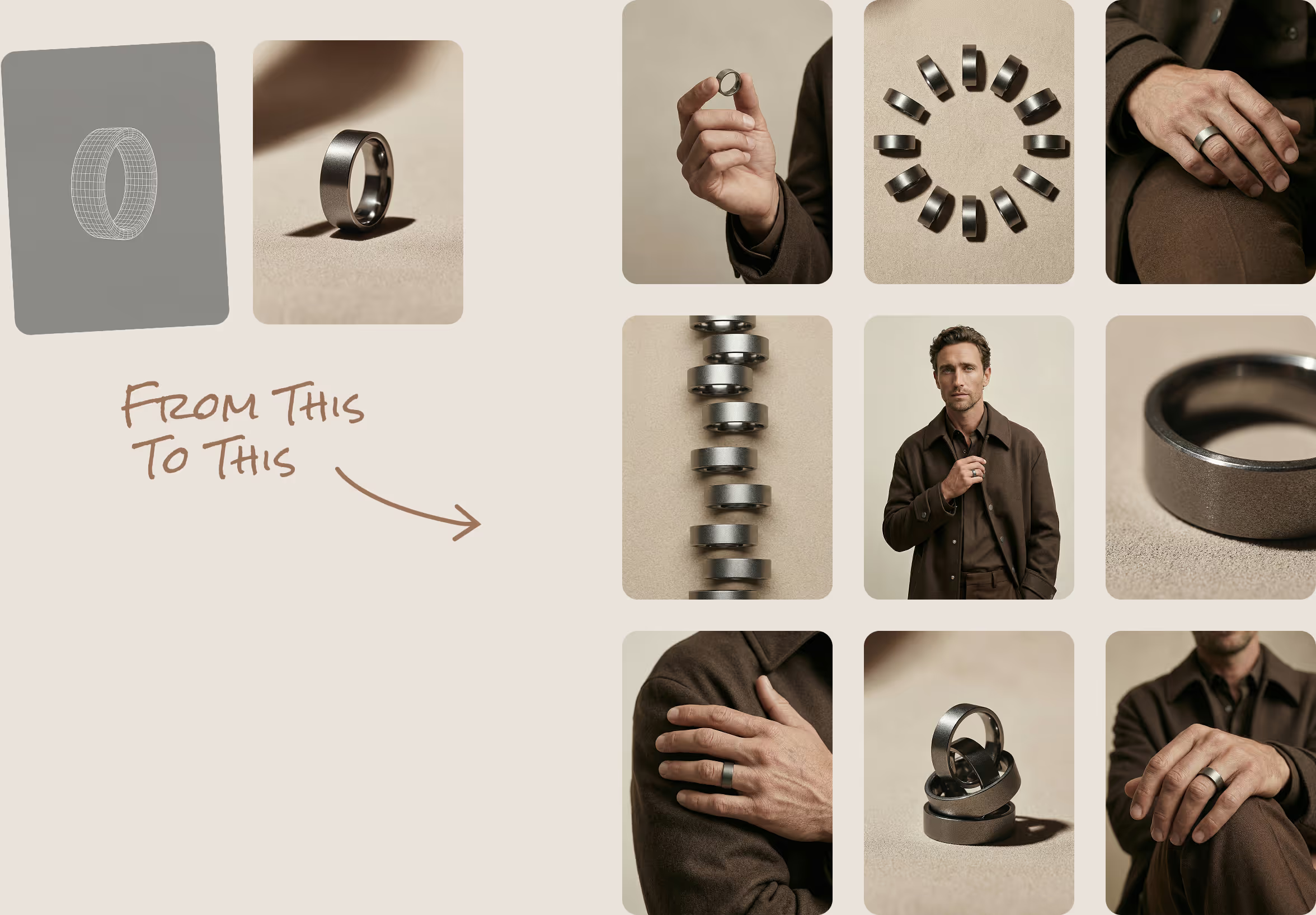
Stacked card content rhythm.
Future-Proof Your Brand
Responsive grid collapse.
Generate Product Shots
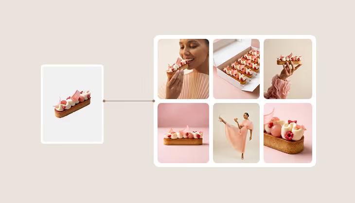
Bento row with content column and media column.

Split media layout
The instructor section pattern pairs rounded imagery with a content column inside the same large container.
Motion & Interaction
Hover transitions, tab timing, accordion reveal hooks, and background video controls.
Accordion content uses the Webflow interaction hook from the original FAQ block.
duration-in 400ms
duration-out 200ms
Scale content without limits.
This closing CTA preserves the original dark card, alternate button, and center alignment.